Mobility and Scalability
This year it is predicted that mobile internet searches will surpass all desktop internet usage by more than 85%! REALTORS® now need to make sure their websites and listing search pages are 'mobile friendly'. Smart Agents know the lions share of web traffic to their site now comes from mobile devices (SmartPhones and Tablets).
RE/Advantage has various mobile solutions for the real estate professional or office to ensure compatibility with the latest trends in mobile technology.
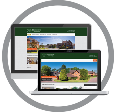
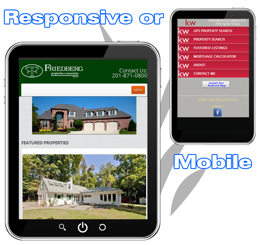
Responsive design is a flexible web design which improves a user's experience based on the device they're using. It includes, but is not limited to, responsive CSS, feature detection, progressive enhancement and other processes. In short your website will adapt to any device from a PC to a Laptop to a Tablet to a Phone. Responsive websites provide your visitors with a cohesive, consistent experience no matter what device they are using when using your site.
RE/Advantage has taken this a step further and has redesigned all of our IDX and Real Estate Widgets to also be responsive.
Mobile websites have dynamic and indexable pages as well as downloadable shortcut buttons that create the illusion of an easy to use app all while remaining search engine friendly. They are designed exclusively for mobile and small portable devices, and do not scale to desktop proportions. They give the user a fast, easy-to-use experience on their mobile device, and are usually limited in functionality when compared to their desktop companions.

Copyright © 2026 RE/Advantage. All Rights Reserved.